Showing posts with label minimal. Show all posts

Vinho De Amora fonts from Mans Greback - (jflyb)

Vinho De Amora
Vinho De Amora Vinho De AmoraVinho De Amora


Vinho De Amora is a truly vintage serif font. 


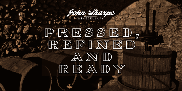
Drawn by Mans Greback between 2019 and 2021, this font is created with inspiration from wine cellars, painted typography and genuine quality produce. 


It has a distinct sharp character, steady legs and a bold and wide appearance. 


The Vinho De Amora family consists of three styles: Black, White and Stencil; each one geometrically consistent and complimenting, perfect for stacking on top of each other to create more variations. 


The font is built with advanced OpenType functionality and has a guaranteed top-notch quality.

It has extensive lingual support, covering all European Latin-based languages. 

It contains all characters and symbols you'll ever need, including all punctuation and numbers. 


Download Styro Font Family From Indian Type Foundry

Download Styro Font Family From Indian Type Foundry
Download Styro Font Family From Indian Type Foundry Download Styro Font Family From Indian Type FoundryDownload Styro Font Family From Indian Type Foundry


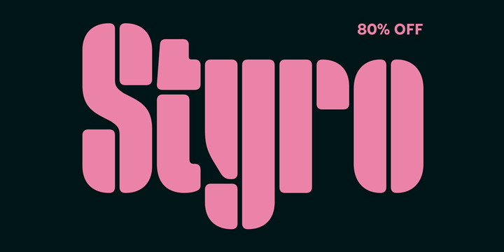
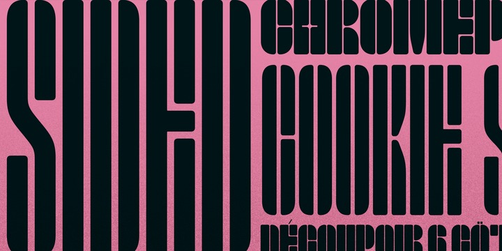
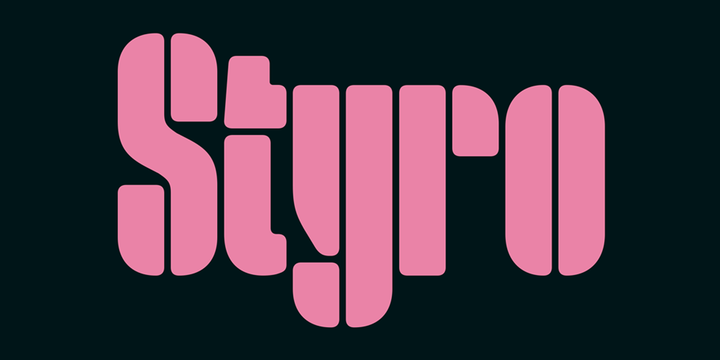
Styro is a family of modernist-style stencil fonts. There are eight weights available, ranging in color from Thin through Black. All of the typeface’s weights are virtually monospaced, and with each weight of the family, the outside ‘strokes’ building up the letterforms increase in thickness. Styro’s characters are very condensed, and their design employs a reductionist formal vocabulary. For example, the counter-forms are expressed by thin lines that run inside of the letters, from their tops to their bottoms. These ‘counters’ are optically of the same width as the spaces between each letter. Many of the fonts’ stroke terminals – like those on the top of the ‘a’ or on the bottom of the ‘g’ – are reduced to simple geometric shapes. Diacritic marks take the form of light thin lines, which create a nice degree of contrast with their base letters. This thin-line treatment is also applied to many of the fonts’ punctuation marks. Styro is reminiscent of a series of stencil letters designed at the Bauhaus by Josef Albers, although Styro includes separate shapes for both uppercase and lowercase letters, instead of being a unicameral design. The Styro fonts were developed by Aarya Purohit at Indian Type Foundry, and they are an excellent choice for use in editorial design pieces about modern art and design.


Download Styro Font Family From Indian Type FoundryDownload NowView Gallery